10 Easy Tricks That Will Make Your Website More User-Friendly
Do you want to increase your website traffic? Yes, then improving your website usability and making your site more user-friendly is how you do so.

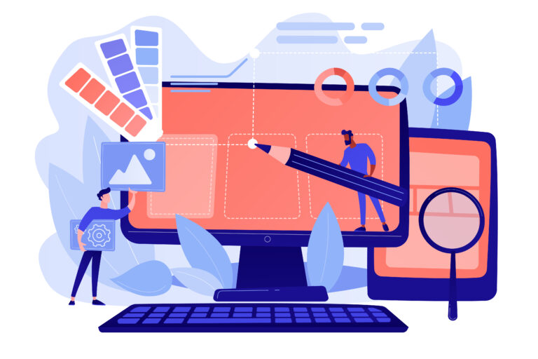
In this digital world, businesses need a website more than ever before to reach customers. So, simply putting the website on the web is not a good idea. The website should be attractive and get visitors the right information as effortlessly as possible. Many businesses make the mistake of neglecting website design. User-experience is critical for the success of any website and should never be overlooked. To increase the chances of getting high traffic, a user-friendly website is absolutely non-negotiable. Make your website with an effective and modern trendy design that your viewers will love to visit.
Website first impressions matter. let’s have a look at some important points for a User-friendly website:
- Build a simple and consistent layout
- Easy to navigate
- Make your site Mobile-friendly
- Optimise website speed
- Good use of white space
- Perfect CTAs
- Informative header and footer
- Use attractive Images
- Add social media icons
- Find and Fix 404 errors
1. Build a simple and consistent layout:

We can say that Website design can make or break your brand’s online presence. With the proper website layout, you are not only introducing your brand and services but inviting people to learn more and convince them to buy from you. Check out some important points for a well-designed layout:
- Keep it Simple and attractive
- Consider list order in the content
- Place the Website logo on the left
- Put the Website logo in the Header and Footer
- Contrasting color scheme
- Select the suitable font style
**2. Easy to Navigate: **
Proper navigation is one of the main factors of website usability. If your website navigation is too poor then users will leave your website quickly and may not decide to continue exploring your website. Well-designed navigation can be very effective in gaining more user interest in your website.

Search Function: Include the search function in your site menubar, it gives users a smooth and seamless experience.
Categories: If your site is big and has many pages and sections then you can use a drop-down menu or sub-navigation in the form of categories. It can help users exactly what they’re looking for.
Good Internal Linking: It is one of the main SEO ranking factors. Internal linking means any links from one page of a domain, linked to another page within the same domain. By using proper Internal linking, you will ease your visitor’s navigation on your site. It improves page rank, user experience, and usability.
3. Make your site Mobile-friendly:
Most of your customers are checking you out from their mobile phones. It’s your responsibility to give them a better experience. Mobile-friendly website means it is designed to display properly on any device like iPhone, Android, or tablet. It adjusts to the smaller screen size and gives the best browsing experience to the users.

Having a mobile-friendly website means,
- Amplify Visibility
- Increase customer-experience
- Build trust
- Improve Mobile Conversion Rate
- Better Google Ranking
- Enhanced Brand Identity
4. Optimise website speed: Faster websites provide a much better User-experience. Website loading speed is very important because it’s affecting everything, from your conversation rate to your website ranking. Websites that take a long time to load can increase your bounce rate. It doesn’t matter if you have a complex or well-designed site if it takes forever to load.
You can easily improve your website speed by,
- Minify CSS, HTML, and Javascript files
- Image compression
- Reduce HTTP requests
- Use asynchronous loading
- Minimise time to first byte
- Do away with redirects
- Remove unused scripts/files
5. Good use of white space:
White space is empty space around the content which creates a visual hierarchy on a page and helps to brand design. It is also known as a ‘Negative space’. White space makes the text more readable and creates connections between individual elements. It’s a powerful tool and without using white space design, brilliant artwork goes unnoticed.
**6. Perfect CTAs: **

It stands for Call-to-action, specially designed to get a specific response from the website users. It tells users what to do, i.e: Order now, send feedback, sign up, log in, contact us, etc. On a website, each piece of content is important. If your website doesn’t have a CTA, your website users have no way to take any action, and no action means no conversion. A perfect, relatable and well-used CTAs plays an important role to increase the conversion rate.
7. Informative header and footer: The header and footer both are key elements of your website. For a website to be effective, every part of the webpage, from header to footer needs to add its overall readability. They both contain additional information and links to important pages of your website.
The header is the first thing that people will see when they visit any website. In the header, you can add the logo, navigational links and menus, search bar, signup/Sign in, and CTA.
The footer is as important as the header. Footer is your last chance to grab your user’s attention. In the Footer, you can add the logo, website sitemap, navigation, brand summary, contact information or contact form, social icons, and back-to-top links.
8. Use attractive Images:
Images are a powerful way to grab the user’s attention. Images and photos have always been an important part of visual communication.
Use relevant and high-quality images without distortion. Images with large pixels and high-resolution work best for the website layout. Also, choose images with call-to-action, so you can convert your visitor into a customer.
9. Add social media icons:
A strong Social Media presence is an essential part of businesses nowadays. If you have active social media accounts then add them to your website in the form of Social Media icons. It will lead your visitors to your business’s Social Media pages. With the help of these icons, they can like, comment, and share your content which gives you more users or even sign up as a follower.
![]()
We have to maintain the connection and trust factor with our users and having social icons on our websites play an important role in this.
**10. Find and Fix 404 errors: **
404 error is what all of us have already faced at some point on the internet. 404 error is an HTTP status code that means the server couldn’t find the page they were looking for. No one likes to get disappointed when they click any link on your website. Users want the relevant information.
404 error pages can be irritating for users and it is also not so good for your SEO ranking. But that doesn’t mean you can just sit there and let the 404 error page give a bad experience to your users. You can find your 404 error pages by using SEO audit tools and you can make them usable by following the below points:
- Make a creative page design
- Redirect your users to the homepage or product page
- Add search bar
- Offer some discount coupons
When people are looking for any information, they are directly going online and searching on search engines. Mostly, they find their answers on the first page of a search engine, so that is where you want your company to appear. So for that, you have to focus on the website SEO and a user-friendly website is one of the most important SEO ranking factors.
Are you ready to build your user-friendly website? You can implement the above tricks and get the best results. Digitalzoop helps you to create an amazing user-friendly website with all SEO factors, that will help you to get success in the online marketplace.